Visual Identity Project
Visual Identity Project
Visual Identity Project
Hithnawi Shawarma
Hithnawi Shawarma
Hithnawi Shawarma
Overview
Overview
Overview
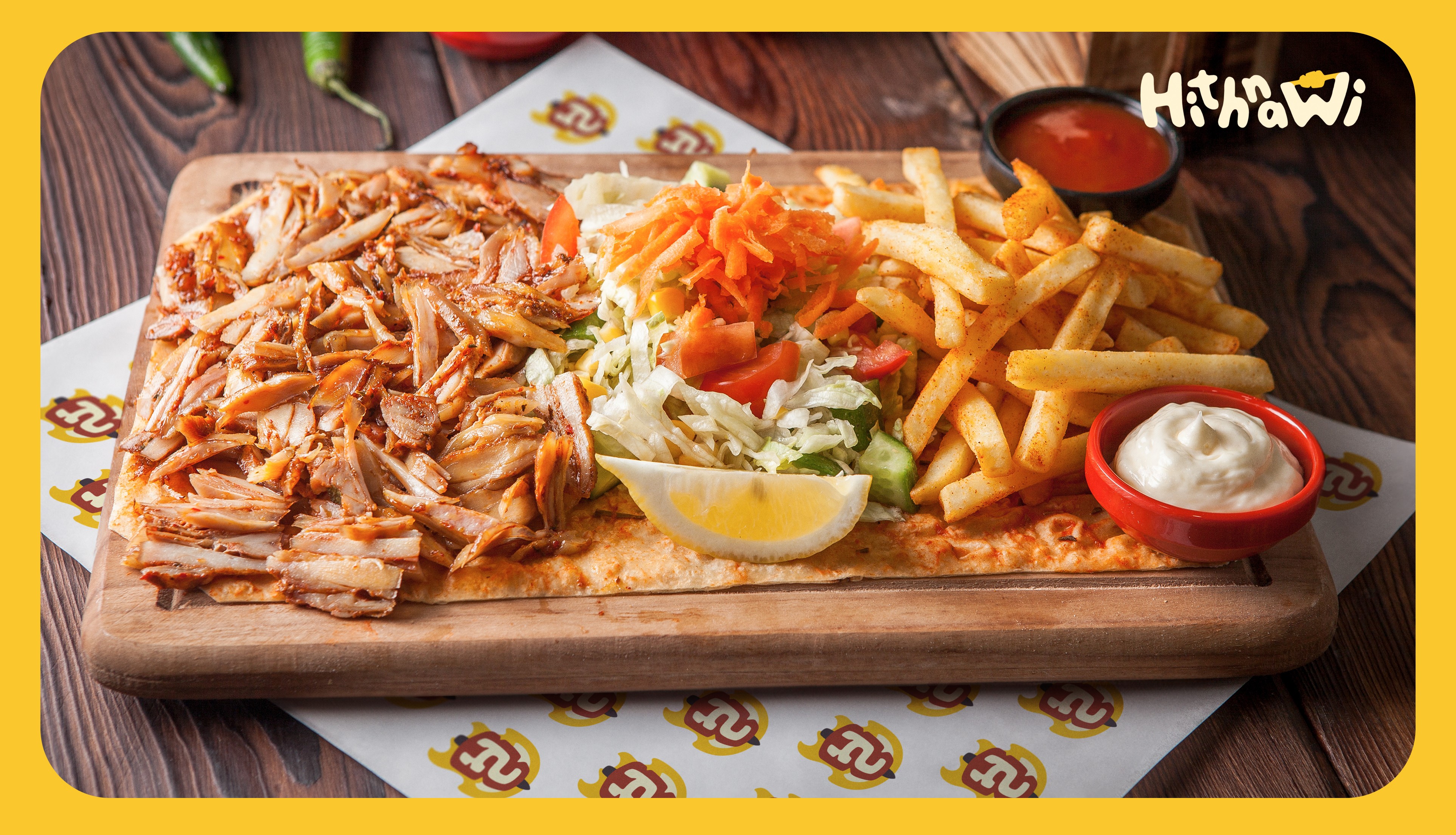
Hithnawi, a beloved shawarma restaurant chain in Palestine, underwent a revitalizing rebranding initiative to address existing branding issues. The primary goal was to create a contemporary visual identity that resonates with the younger demographic, a significant portion of their customer base. The result is a cohesive and lively brand identity that infuses Hithnawi's heritage with a fresh appeal.
Hithnawi, a beloved shawarma restaurant chain in Palestine, underwent a revitalizing rebranding initiative to address existing branding issues. The primary goal was to create a contemporary visual identity that resonates with the younger demographic, a significant portion of their customer base. The result is a cohesive and lively brand identity that infuses Hithnawi's heritage with a fresh appeal.
Hithnawi, a beloved shawarma restaurant chain in Palestine, underwent a revitalizing rebranding initiative to address existing branding issues. The primary goal was to create a contemporary visual identity that resonates with the younger demographic, a significant portion of their customer base. The result is a cohesive and lively brand identity that infuses Hithnawi's heritage with a fresh appeal.
Problem
Problem
Problem
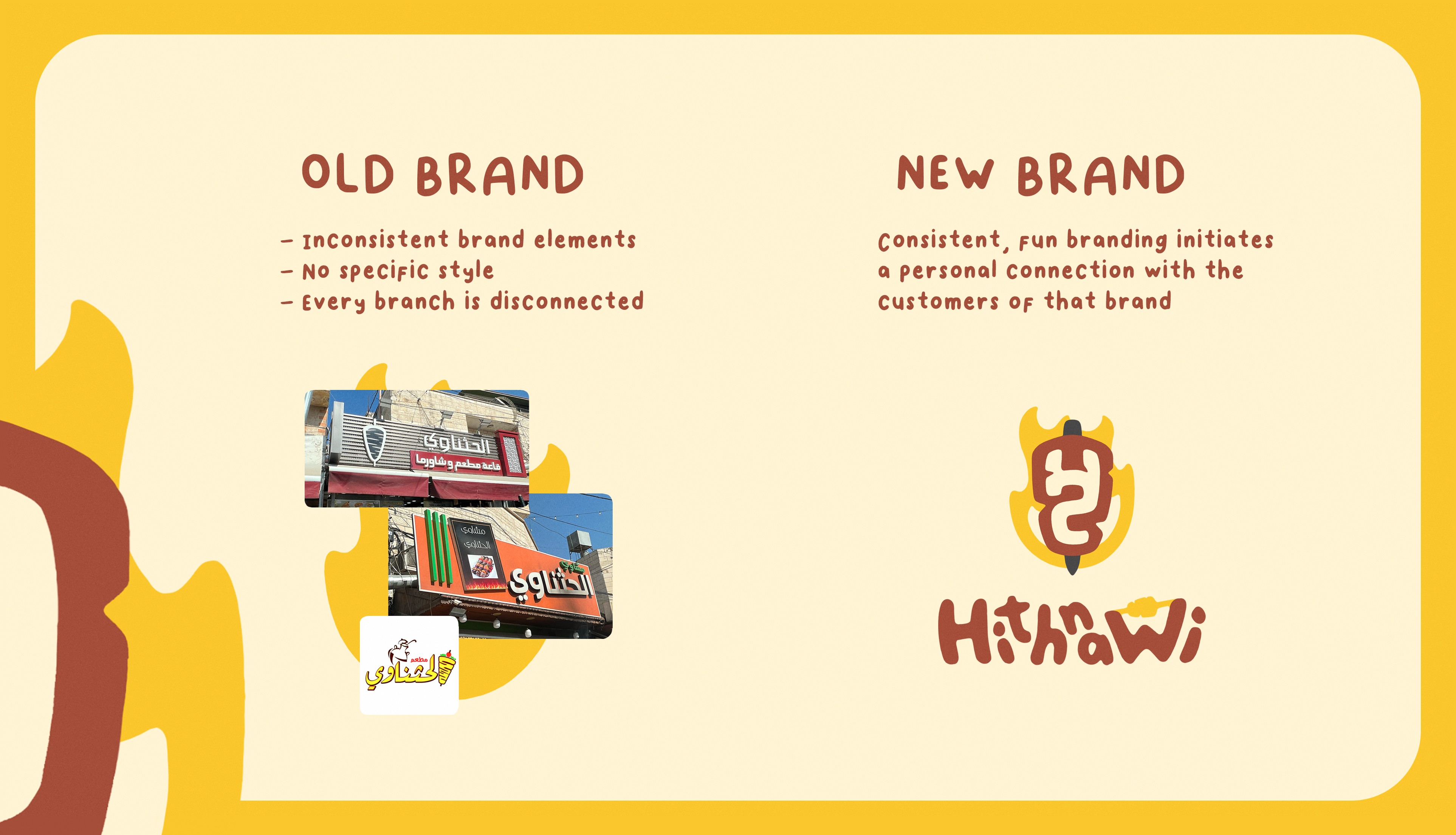
Hithnawi faces a significant challenge with its current branding—namely, inconsistency. The use of their logo varies across different platforms, such as boards and social media, leading to a lack of visual harmony and recognition. Additionally, the absence of a consistent brand style across different locations further compounds the issue. As a result, customers experience a fragmented brand journey, which hinders their emotional connection to the brand. While Hithnawi's food quality remains a draw, the lack of a unified brand experience diminishes the overall impact and loyalty of customers.
Hithnawi faces a significant challenge with its current branding—namely, inconsistency. The use of their logo varies across different platforms, such as boards and social media, leading to a lack of visual harmony and recognition. Additionally, the absence of a consistent brand style across different locations further compounds the issue. As a result, customers experience a fragmented brand journey, which hinders their emotional connection to the brand. While Hithnawi's food quality remains a draw, the lack of a unified brand experience diminishes the overall impact and loyalty of customers.
Hithnawi faces a significant challenge with its current branding—namely, inconsistency. The use of their logo varies across different platforms, such as boards and social media, leading to a lack of visual harmony and recognition. Additionally, the absence of a consistent brand style across different locations further compounds the issue. As a result, customers experience a fragmented brand journey, which hinders their emotional connection to the brand. While Hithnawi's food quality remains a draw, the lack of a unified brand experience diminishes the overall impact and loyalty of customers.



Solution
Solution
Solution
To tackle the problem of inconsistency and create a more engaging brand experience, the rebranding initiative centers on a clear, fun, and youthful style. By infusing the brand with these playful elements, it becomes more flexible in its designs, ensuring greater coherence across various touchpoints. The introduction of a comprehensive brand style guide reinforces consistency in typography, color palette, imagery, and design elements, unifying the visual language across all locations.
With a consistent inclusion of these branding assets, customers will develop a clearer understanding of what Hithnawi represents and what to expect from the brand at every visit. The joyful and consistent experience across all outlets fosters a stronger emotional connection with the customers, encouraging repeat visits and increased loyalty.
Moreover, the revamped branding is designed to leave a lasting impression on customers, making it more memorable and catchy. This enhanced appeal will help Hithnawi gain traction over the web, attracting new customers who are drawn in by the brand's fresh and engaging identity. As a result, Hithnawi is poised to establish a stronger presence in the market and enjoy greater success in a competitive industry.
In conclusion, by addressing the problem of inconsistency through a youthful and flexible brand style, Hithnawi's rebranding initiative not only enhances the overall customer experience but also boosts brand recognition and loyalty. The revitalized branding serves as a unifying force, instilling confidence in customers that they can expect the same quality and joyous experience at any Hithnawi location.
Logo
Logo
Logo
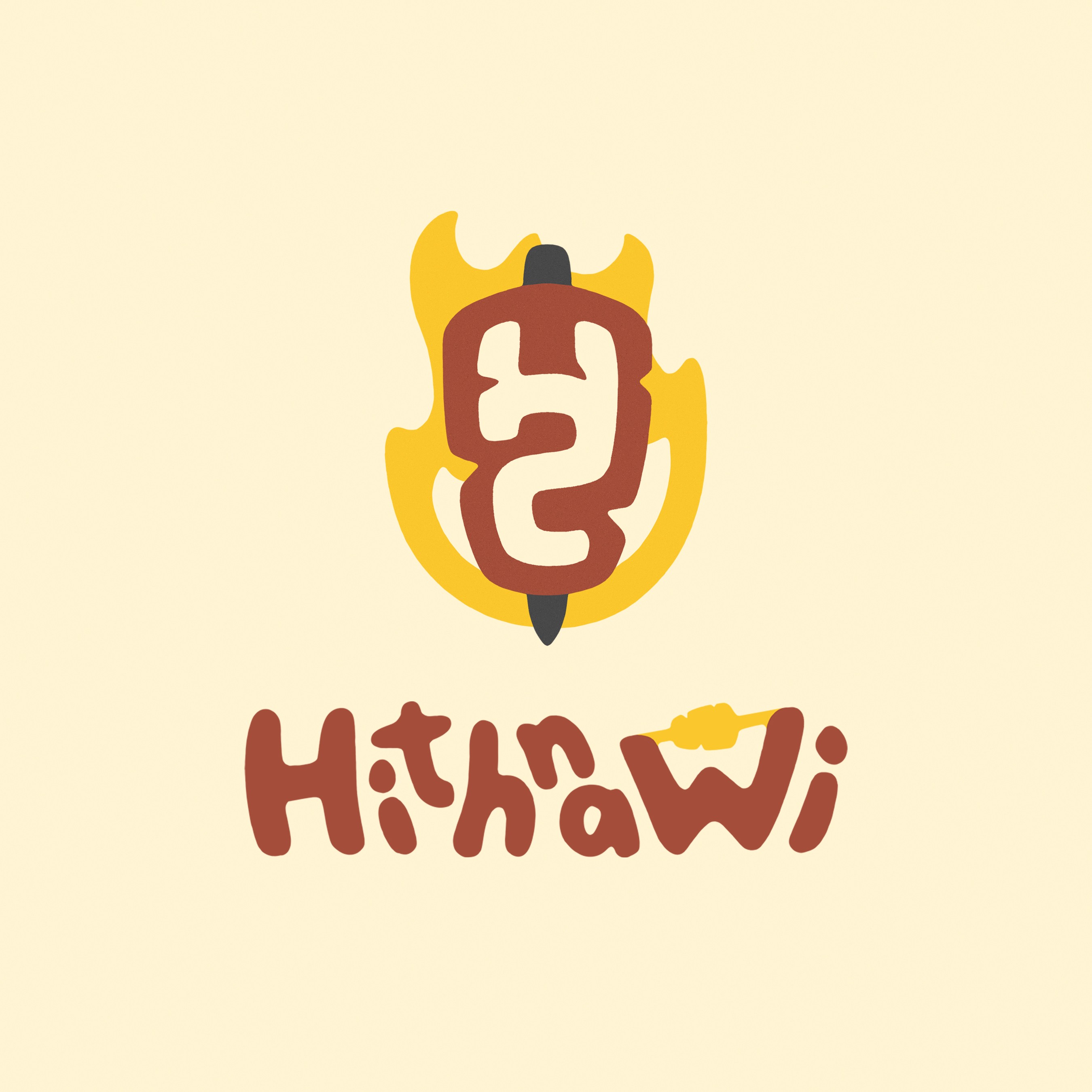
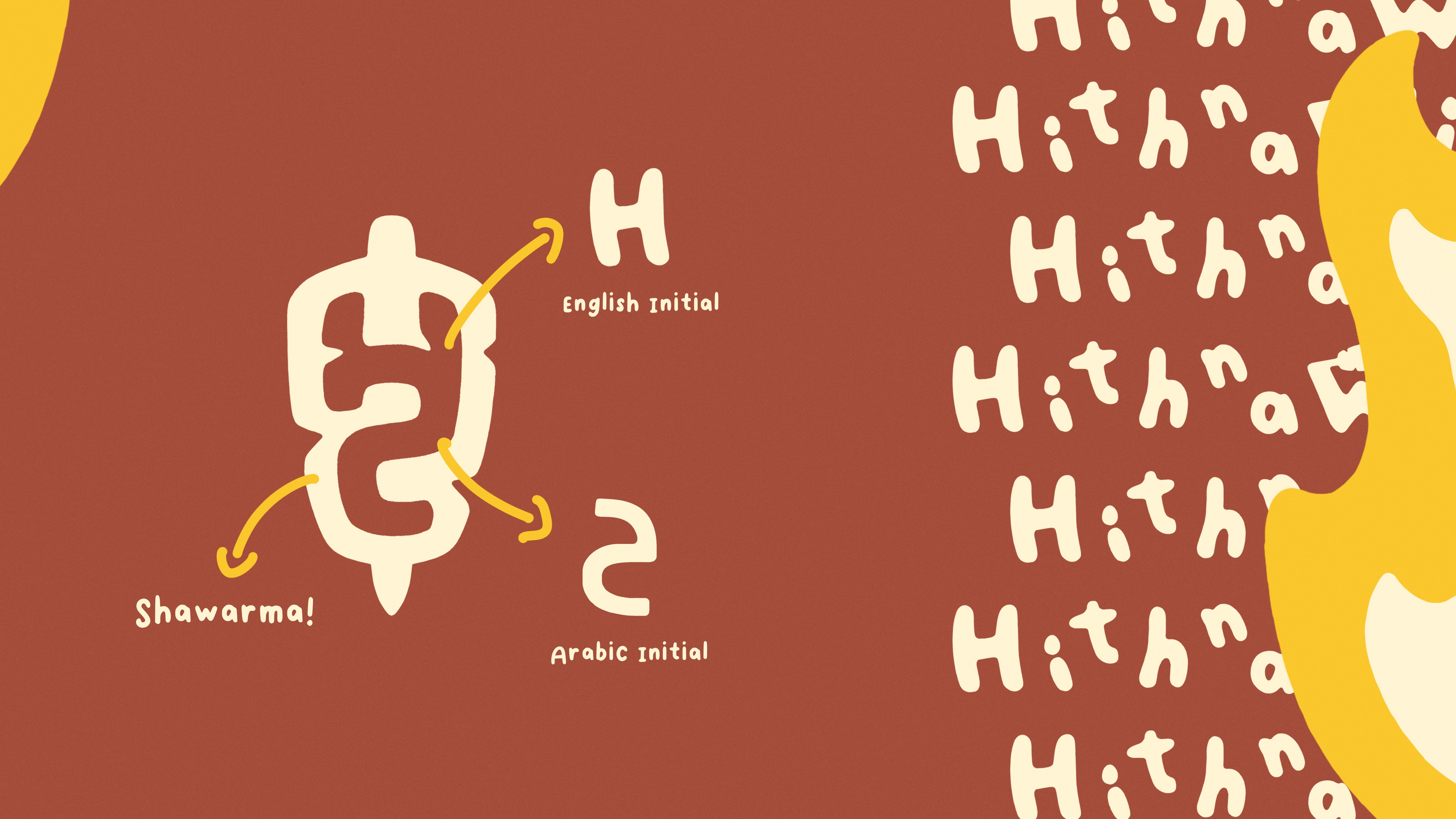
The logo was designed to be both simple and straightforward, featuring a shawarma grill alongside the brand's initials. This clean and uncomplicated mark serves two primary purposes: clearly representing the brand as a shawarma place and ensuring enhanced memorability among the younger market.
The logo was designed to be both simple and straightforward, featuring a shawarma grill alongside the brand's initials. This clean and uncomplicated mark serves two primary purposes: clearly representing the brand as a shawarma place and ensuring enhanced memorability among the younger market.
The logo was designed to be both simple and straightforward, featuring a shawarma grill alongside the brand's initials. This clean and uncomplicated mark serves two primary purposes: clearly representing the brand as a shawarma place and ensuring enhanced memorability among the younger market.
Other Graphics
Other Graphics
Other Graphics
In addition to the logo, the branding encompasses custom playful lettering, various pattern options, a unique typography that reflects the brand's values, a carefully chosen color scheme, and additional design assets, including simple fire illustrations.
In addition to the logo, the branding encompasses custom playful lettering, various pattern options, a unique typography that reflects the brand's values, a carefully chosen color scheme, and additional design assets, including simple fire illustrations.
In addition to the logo, the branding encompasses custom playful lettering, various pattern options, a unique typography that reflects the brand's values, a carefully chosen color scheme, and additional design assets, including simple fire illustrations.


Menu
Menu
Menu
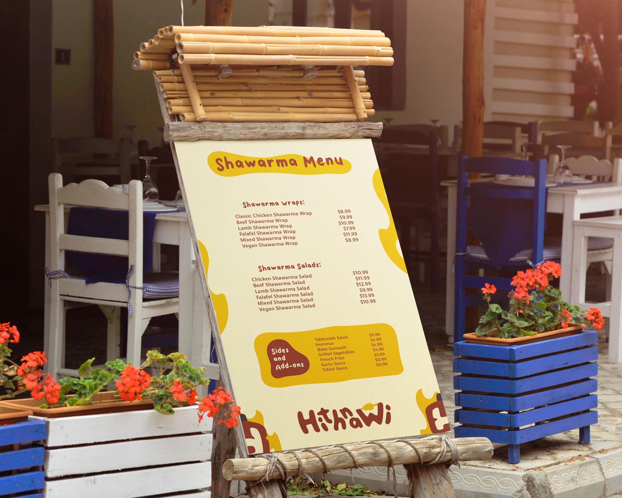
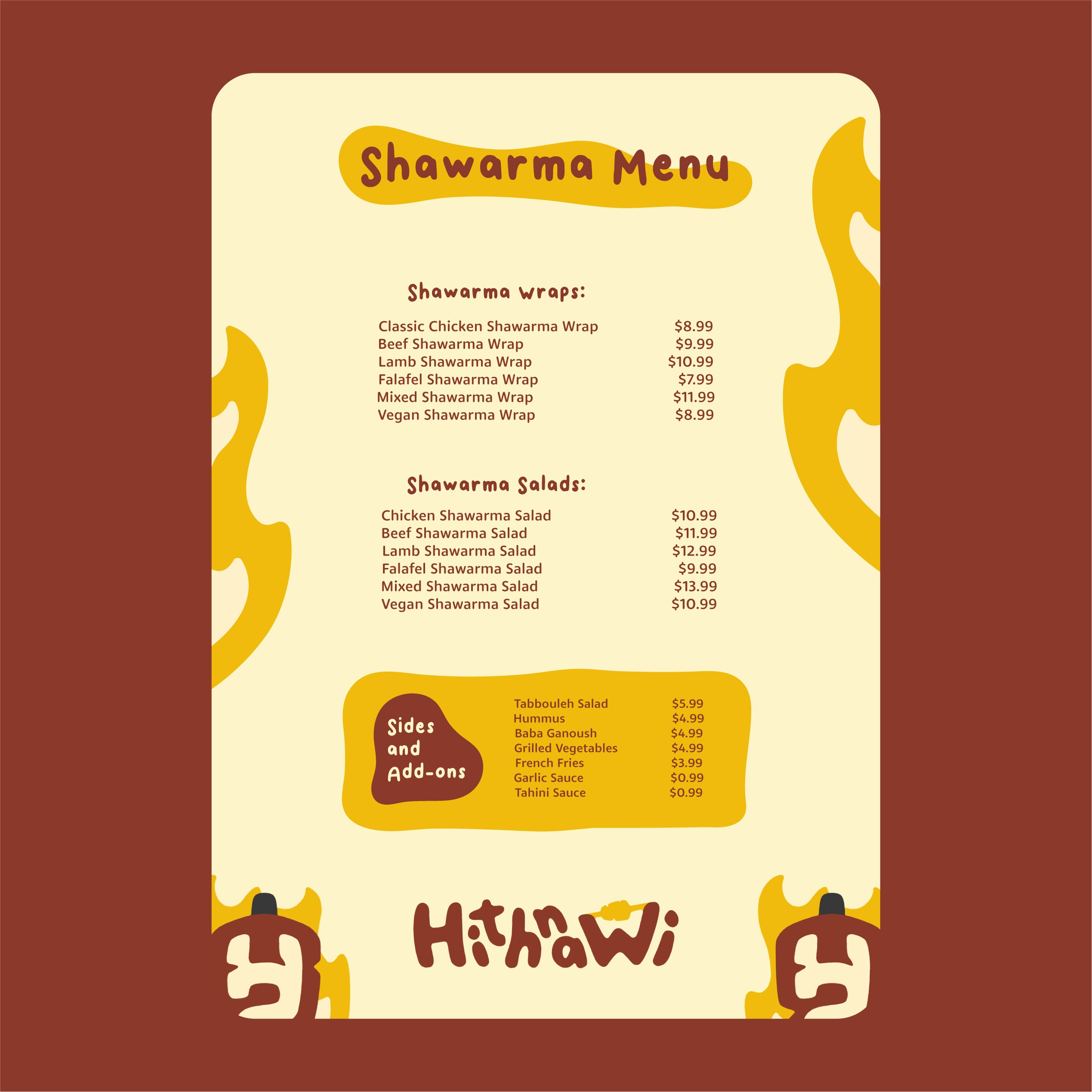
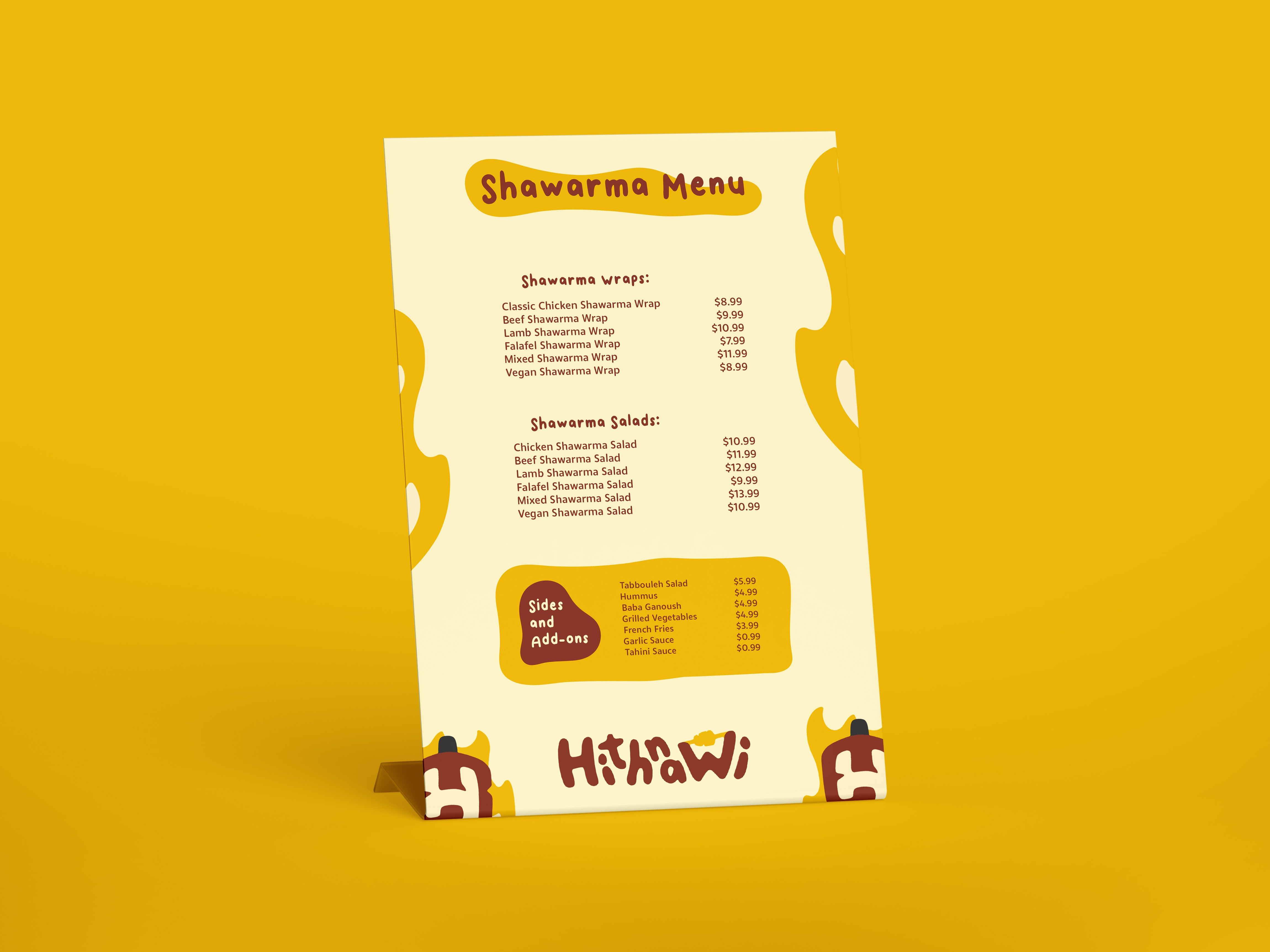
The primary objective of the menu is simplicity and ease of readability. Given that most of Hithnawi shawarma's market has English as their second language, a user-friendly menu is paramount. Moreover, the menu maintains consistency with the brand style, incorporating only elements from the style guide.
The primary objective of the menu is simplicity and ease of readability. Given that most of Hithnawi shawarma's market has English as their second language, a user-friendly menu is paramount. Moreover, the menu maintains consistency with the brand style, incorporating only elements from the style guide.
The primary objective of the menu is simplicity and ease of readability. Given that most of Hithnawi shawarma's market has English as their second language, a user-friendly menu is paramount. Moreover, the menu maintains consistency with the brand style, incorporating only elements from the style guide.
Want to start working
on your branding?
Get in touch for a free consulting call on what your business really needs!
Unsure if I am the right fit for your business?
Get in touch for a free consulting call on what your business really needs!
Unsure if I am the right fit for your business?
Get in touch for a free consulting call on what your business really needs!